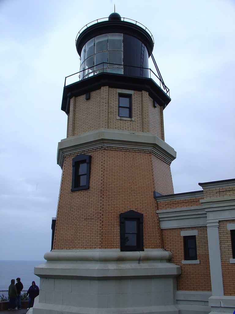
clocktower logo
I think SIUC should learn a big lesson from the recent fuss about the logos.To recap, several things happened, and my own version may be a little based on hearsay, but I'll retell the best I can. First, a new chancellor hired a PR company to review our image; that company decided that the clocktower logo had to go; it put in a temporary logo which has only letters and is maroon, blockish and plain (more in tune with history, but somewhat bland) saying that they are working on a better one which will appear soon.
Now this bland logo appeared in the middle of labor strife and was met with derision widely. It seemed that people were very angry that the university could spend thousands on bad PR, at the same time having furloughs for faculty and not budging at all in union negotiations. Without judging the merit of the financial arguments, I was struck by the loyalty people had for the clocktower logo. It wasn't especially popular when it first showed up, though I liked it. Now all of a sudden it was everyone's favorite.
The more I listened to people the more I became convinced that they actually liked that clocktower; they'd become accustomed to it, and they really didn't want to go back to the bland letter-only version. That's because it had an image, and they related to the image. The lesson I derive from this is: bring us another image. If the clocktower isn't acceptable (I heard that it was being interpreted as a church, abroad, which may well be true), then find a better one. In the end, I don't think it was that related to the labor strife, but the comments I heard were all from people who live, breathe and snore Saluki maroon, day in and day out. Those are the people you want to please, in the end.
posted by tom @ 7:02 PM
![]()


0 Comments:
Post a Comment
<< Home